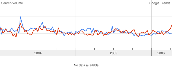
So, what does this one do? This gives you a graph showing the number of users who have searched on a particular topic over a period of time. Say, for instance I search for Harry Potter from 2004 till today, I’ll get a graph showing how the search pattern has varied over time. So, just before a book release you can expect some tall peaks. You can also compare one search item against another (or how many ever), in which case you’ll have two (or more) lines on your graph. Not only that, you can also search by region/language/cities (U.S. cities).
Now, what’s really interesting about this product was that it has something in it for everyone. If you’re an analyst looking for trends or comparisons, this is just what you want. Or if you’re jobless, and have little else to do, you’ll really love this.
Here are a few comparisons that I did.
Wipro(Blue) vs. Infy(red)

Wipro(blue) vs. Infosys(Red)

Looks like a lot of people still prefer typing the longer and more official version (btw, these are search results within India). And, if you don't see the Red line in the first graph, thats because, there's not enough volume to show on a graph. Anyway not much of a comparison between these two, although when you put in TCS and CTS, you'll see some real difference.
Kamal(Red) vs. Rajini(Blue)

Here’s a comparison between Rajani and Kamal. Surprise, surprise…. Kamal’s way ahead of Rajini as far as he searches go (and mind you, the results don’t change a lot even if you substitute Superstar for Rajini). So go on, make your own comparisons, whatever be ur reasons.

1 comment:
I cannot accept the last result Kamal vs Rajini....
Kamal in the results does not mean only kamal hasan and Ranjni in the search context does not consider only superstar rajnikanth.
Post a Comment